|
I recently had the treat of taking part in the Mark Eanes Colour & Design 3 day Intensive. I learnt so much and know you'd like to hear all about it! I’ve always been a fan of colour, as you probably know, and I knew the basics of the colour wheel (primary, secondary, tertiary, complements) but this course took me WAY beyond and into a whole new adventure that I realised I was only scratching the surface of! Prismatic hues, chromatic and achromatic greys, analogous hues were all new things to me.
Colour Categories
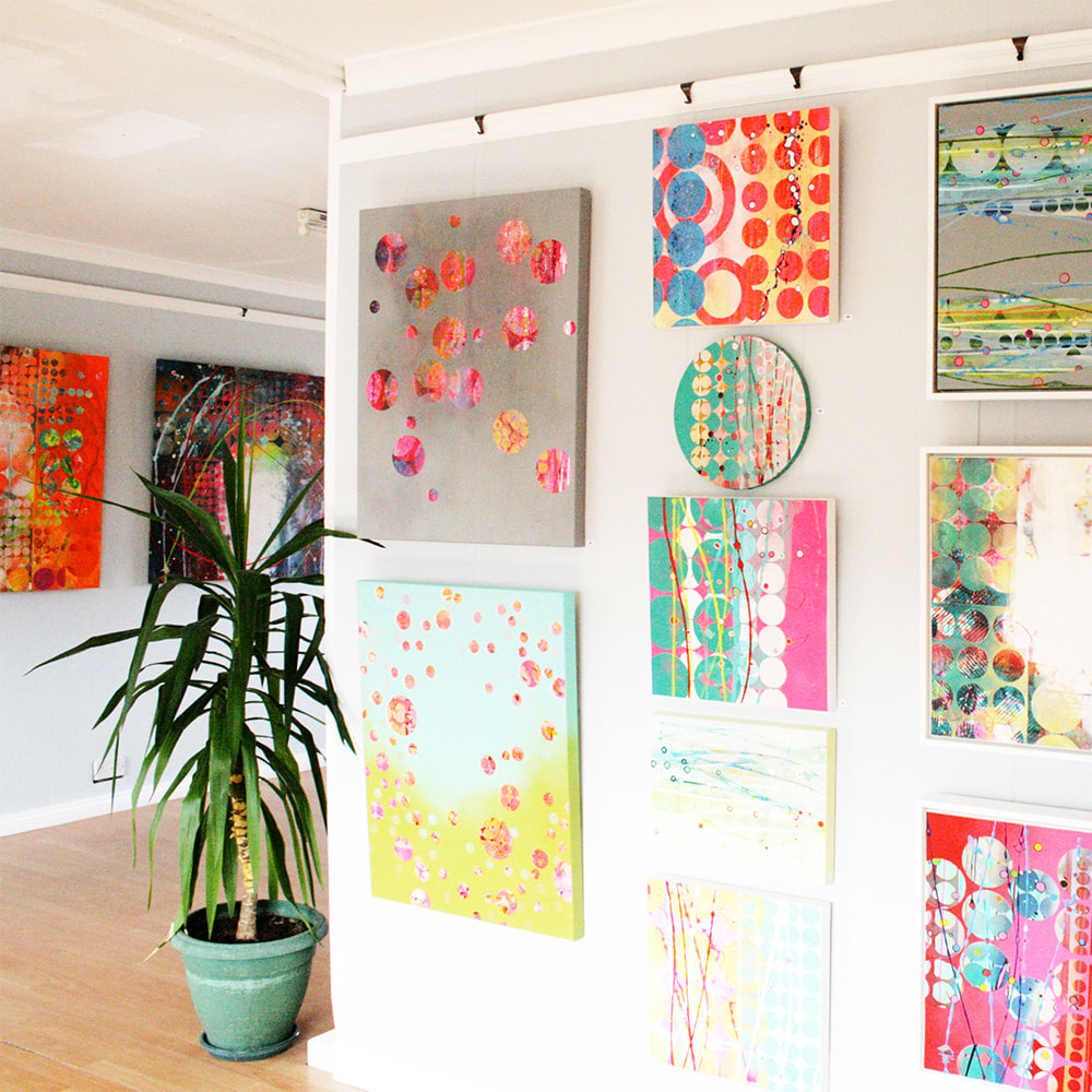
What is a Prismatic Hue? The purest, most saturated and intense colours. Red, yellow and blue, and the rest of the 12 colours they mix on the colour wheel. What is a Muted Hue? These are not as saturated or intense as prismatic as they have another colour, white, black or grey mixed into them. What is a Chromatic Grey? These have little saturation or intensity, they can be very dark or very light or middle tones and they aren’t necessarily grey! Colour Design Day 2 and 3 we looked at composition and layout of art, looking at artists like Mondrian. We used the colour swatches we’d made to make designs of our own, based around the colour categories and relationships that we were learning about. Obviously it’s only when you try using your new knowledge that you test if you understand it!! Here are my results 2 pictures per colour group. Both with a wide range of hue (colour) but then 1 had to be with a wide range of value (light & dark) and the other with a narrow range of value. Can you tell which is which? And can you see what difference it makes? Which colour group and rules are you most drawn to? Does that surprise you?
By the way Mark told us a great tip for checking value, which is viewing through a black and white filter on your phone - narrow range of value should look very similar - see this example. I think the biggest things to come out of this workshop for me is not that I now know clever colour vocabulary but that I discovered new colours and colour relationships that I love and that really excite me. I’m always on the hunt for vibrancy and have leant towards the more pure colours in the past (the prismatic) as I love their intensity, but actually the muted hues and even some of the more saturated chromatic greys, and how they sit with certain other colours, gave me a whole new avenue to explore!
We have ended the course with a whole load of extra exercises to continue with and things to discover. I actually finished realising that I both needed to harness this new passion but also to put boundaries on it, otherwise I could see myself just colour mixing all my days and never achieving anything else! Click HERE for a link to Mark Eanes website for future 3 day and 6 weeks courses. Click HERE to subscribe to my newsletter to follow where this adventure takes me next! And I'd love to hear in the comments below which colour combinations you are most drawn to from the ones I've shared!
1 Comment
|
sign up for blog & newsletter updates
follow me on instagramCategories
All
|


